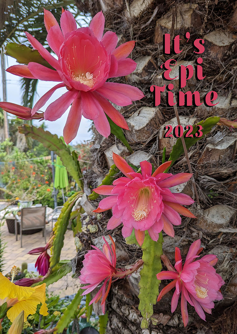
This is the updated carousel in BS 5.
It can be styled to auto start using
<data-bs-ride="carousel">
It can be styled to fade between images, default is slide
<class="carousel slide carousel-fade">
You can opt to not auto start until a first user interaction
<data-bs-ride="true">
Carousel can be images and/or text

bootstrap 5.3 supports a fixed nav bar (above)
<nav class="navbar navbar-expand-sm bg-dark navbar-dark fixed-top"> or you can use fixed-bottom.
this will not work for andrewandterry.net because the fixed-top class would put the nav bar at the top and the animated header would fall below it and be scrolled up with the page. When they say fixed top they mean it!
But it seems to have spacing issues with images put immediately below it.
Placeholder text to demonstrate some inline links with tooltips. This is now just filler, no killer. Content placed here just to mimic the presence of real text. And all that just to give you an idea of how tooltips would look when used in real-world situations. So hopefully you've now seen how these tooltips on links can work in practice, once you use them on your own site or project.
This tooltip button.accordion-body
, though the transition does limit overflow.
.accordion-body
, though the transition does limit overflow.
.accordion-flush
class. This is the first item's accordion body..accordion-flush
class. This is the third item's accordion body. Nothing more exciting happening here in terms of content, but just filling up the space to make it look, at least at first glance, a bit more representative of how this would look in a real-world application.# | First | Last | Handle |
---|---|---|---|
1 | Mark | Otto | @mdo |
2 | Barbra | images can be added to cells and will scale with the other 'columns' in a row | |
842911 | Larry the Bird Tables, rows and cells can have a table class applied to effect color |
Some placeholder content for the collapse component. This panel is hidden by default but revealed when the user activates the relevant trigger.
Placeholder text to demonstrate some inline links with tooltips. This is now just filler, no killer. Content placed here just to mimic the presence of real text. And all that just to give you an idea of how tooltips would look when used in real-world situations. So hopefully you've now seen how these tooltips on links can work in practice, once you use them on your own site or project.
This tooltip buttonCard with Text and Images and a Link
Cards can be styled like most bootstrap objects
Go somewhere